CSS Media queries

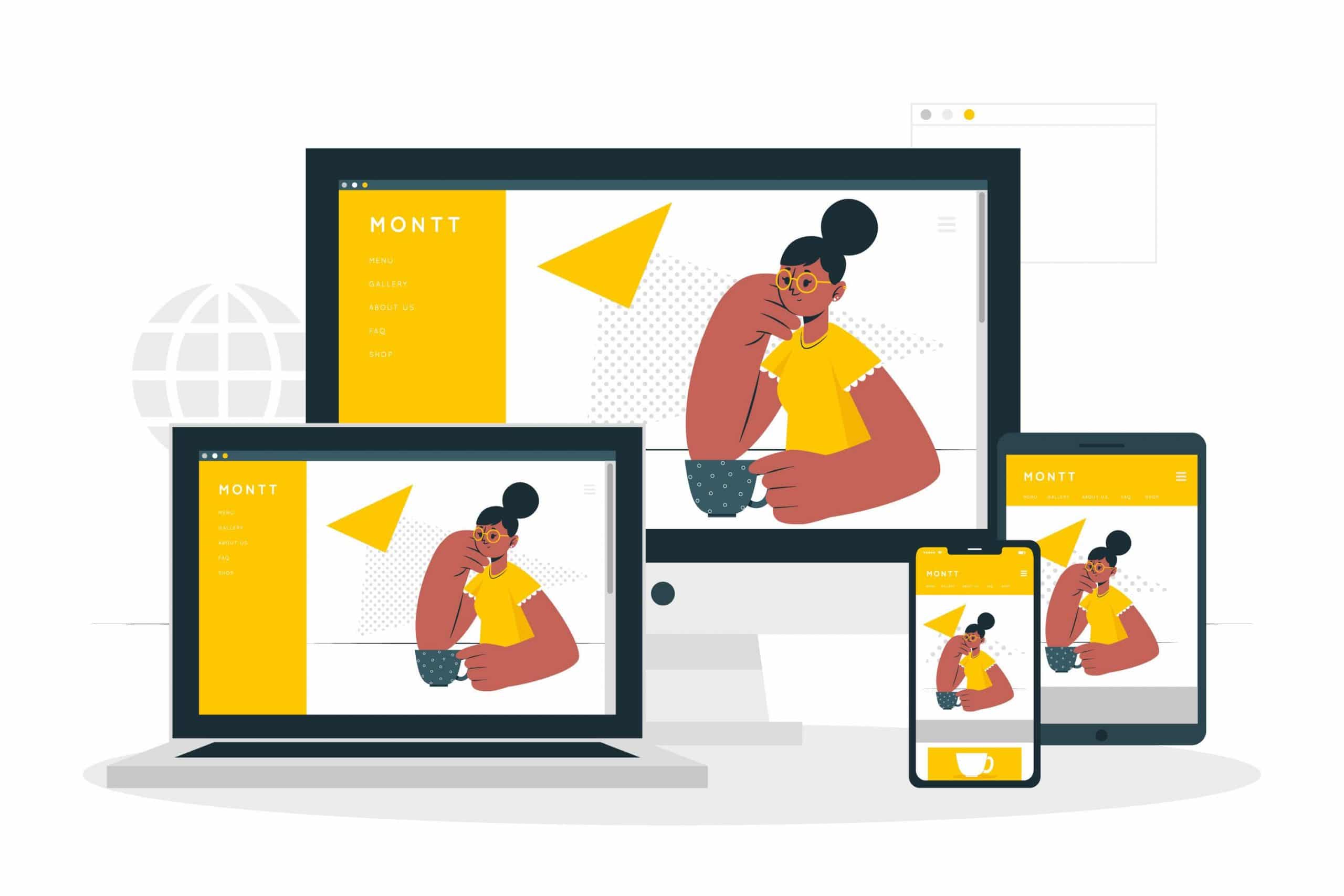
A major component of responsive design is creating the right experience for the right device using CSS Media queries. With a gazillion different devices on the market, this can be a tall task. We’ve rounded up media queries that can be used to target designs for many standard and popular devices that are certainly worth a read.
Choose the Right CSS Breakpoints
A good place to start in this process is to mimic Bootstraps “mobile first” media queries which are defined as the following:
- Min-width: 320px (smaller phone viewpoints)
- Min-width: 480px (small devices and most phones)
- Min-width: 768px (most tablets)
- Min-width: 992px (smaller desktop viewpoints)
- Min-width: 1200px (large devices and wide screens)
Using these standard breakpoints, in combination with better organizing your CSS, will go a long way in keeping your stylesheets as clean and simplified as possible.
But there are also have some breakpoints to focus on your design.
- Max-width: 360px
- Max-width: 375px
- Max-width: 414px
- Max-width: 768px
- Max-width: 1024px
- Max-width: 1440px
Using media queries on HTML
There are a few ways we can use media queries directly in HTML.
There’s the<link> element that goes right in the document<head>. In this example. we’re telling the browser that we want to use different stylesheets at different viewport sizes:
<html>
  <head>
    <!-- Served to all users -->
    <link rel="stylesheet" href="all.css" media="all" />
    <!-- Served to screens that are at least 20em wide -->
    <link rel="stylesheet" href="small.css" media="(max-width: 1024px)" />
    <!-- Served to screens that are at least 64em wide -->
    <link rel="stylesheet" href="medium.css" media="(max-width: 768)" />
    <!-- Served to print media, like printers -->
    <link rel="stylesheet" href="print.css" media="print" />
  </head>
</html>
Using media queries on HTML image source
We can use media queries on <source> element, which informs the <picture> element what version of an image the browser should use from a set of image options.
<picture>
  <!-- Use this image if the screen is at least 800px wide -->
  <source srcset="cat-landscape.png" media="(min-width: 800px)">
  <!-- Use this image if the screen is at least 600px wide -->
  <source srcset="cat-cropped.png" media="(min-width: 600px)">

  <!-- Use this image if nothing matches -->
  <img src="cat.png" alt="SA Bappy loves cat.">
</picture>
Using media queries on CSS
Again, CSS is the most common place to spot a media query in the wild. They go right in the stylesheet in an @media rule that wraps elements with conditions for when and where to apply a set of styles when a browser matches those conditions.
/* Viewports between 320px and 480px wide */
@media only screen and (min-device-width: 320px) and (max-device-width: 480px) {
  .card {
    background: #bada55;
  }
}
Use Responsive Testing Tools
What would be web design and development without testing? There are a handful of tools that come in handy when testing responsiveness, including:
Browser Developer Tools
The trusted inspection and developer tools inherent in most browsers are typically the best place to start your responsive testing. With a handful of default viewpoints built-in, you can start to see how all of your site’s different elements start to respond across a number of dimensions.
While every website is different and your responsive strategy is ultimately dependent on your target audiences, it’s important to try to find as many areas as possible to standardize your CSS. Use the above tips to better build responsive sites and make your CSS the envy of designers.
If have any other question about CSS Media queries and responsive Just ping me a message.